Readings : CSS Layout
Chapter15 :: “layout”
- Block-level elements start on a new line.
-
Inline elements flow in between surrounding text.
- Controlling the Position of Elements

- CSS has the following positioning schemes that allow you to control the layout of a page:
- Normal flow (position:static) Every block-level element appears on a new line, causing each item to appear lower down the page than the previous one. Even if you specify the width of the boxes and there is space for two elements to sit ide-byside, they will not appear next to each other. This is the default behavior (unless you tell the browser to do something else).
- Relative Positioning (position:relative) This moves an element from the position it would be in normal flow, shifting it to the op, right, bottom, or left of where it would have been placed. This does not affect the position of surrounding elements; they stay in the position they would be in in normal flow.
- Absolute positioning (position:absolute/fixed) This positions the element in relation to its containing element. It is taken out of normal flow, meaning that it does not affect the position of any surrounding elements (as they simply ignore the space it would have taken up). Absolutely positioned elements move as users scroll up and down the page.
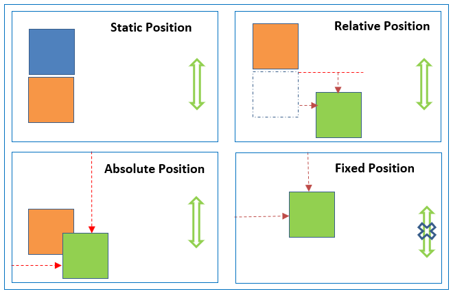
- To indicate where a box should be positioned, you may also need to use box offset properties to tell the browser how far from the top or bottom and left or right it should be placed.
- Fixed Positioning This is a form of absolute positioning that positions the element in relation to the browser window.
- Floating Elements Floating an element allows you to take that element out of normal flow and position it to the far left or right of a containing box. The floated element becomes a block-level element around which other content can flow.
- Using Float to Place El ements Side-by-Side.
- The clear property allows you to say that no element (within the same containing element) should touch the sides of a box. It can take the following values:left, right, both, none.
- z-index property allows you to control which box appears on top.
Grid
- define grid container element (parent) ->
display: grid - set its column and row sizes ->
grid-template-columnsandgrid-template-rows - place grid items (children) into the grid ->
grid-columnandgrid-row
- children are only the direct descendants of the parent element
- Note: column, float, clear, and vertical-align have no effect on a grid container.
Terminology
- grid container
- grid item
- grid line = The dividing lines that make up the structure of the grid.
- grid track = column or row
- grid cell = a single “unit” of the grid.
- grid area = The total space surrounded by four grid lines. Can contain any number of cells.
Layout Summary
-
<div>elements are often used as containing elements to group together sections of a page. - Browsers display pages in normal flow unless you specify relative, absolute, or fixed positioning.
- The float property moves content to the left or right of the page and can be used to create multi-column layouts. (Floated items require a defined width.)
- Pages can be fixed width or liquid (stretchy) layouts.
- Designers keep pages within 960-1000 pixels wide, and indicate what the site is about within the top 600 pixels (to demonstrate its relevance without scrolling).
- Grids help create professional and flexible designs.
- CSS Frameworks provide rules for common tasks.
- You can include multiple CSS files in one page.
You Can Read More About CSS Position, HERE